A simple jQuery plugin to arrange images into a flexible grid, based on Tumblr's photoset feature. Originally the plugin was created for our Style Hatch Tumblr themes as a way to use the photoset grid in responsive layouts, but we have since expanded it for use outside of the themes.
Demos & Usage
Basic Photoset Grid
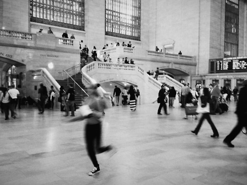

Simply call photosetGrid(); on a div with the data-layout specified and a number of images inside.
HTML:
<div class="photoset-grid-basic" data-layout="12">
  <img src="img/demo/nyc1-500px.jpg" width="1280" height="960" data-highres="img/demo/nyc1-highres.jpg">
  <img src="img/demo/nyc2-500px.jpg" width="500" height="375" data-highres="img/demo/nyc2-highres.jpg">
  <img src="img/demo/nyc3-500px.jpg" width="500" height="667" data-highres="img/demo/nyc3-highres.jpg">
</div>
Javascript:
$('.photoset-grid-basic').photosetGrid();
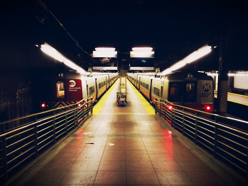
Custom Options

Beyond the basic usage, you can set a number of optional arguments including callback functions that are useful for adding a lightbox for high resolution images. Additionally the images in this example do not specify height and width, so the plugin waits for all the images to load before laying out the grid.
HTML:
<div class="photoset-grid-custom" style="visibility: hidden;">
  <img src="img/demo/print1-500px.jpg" data-highres="img/demo/print1-highres.jpg">
  <img src="img/demo/print2-500px.jpg" data-highres="img/demo/print2-highres.jpg">
  <img src="img/demo/print3-500px.jpg" data-highres="img/demo/print3-highres.jpg">
</div>
Javascript:
$('.photoset-grid-custom').photosetGrid({
  // Set the gutter between columns and rows
  gutter: '5px',
  // Manually set the grid layout
  layout: '21',
  // Wrap the images in links
  highresLinks: true,
  // Asign a common rel attribute
  rel: 'print-gallery',

  onInit: function(){},
  onComplete: function(){
    // Show the grid after it renders
    $('.photoset-grid-custom').attr('style', '');
  }
});
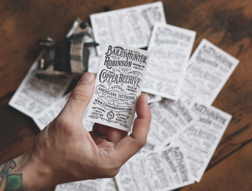
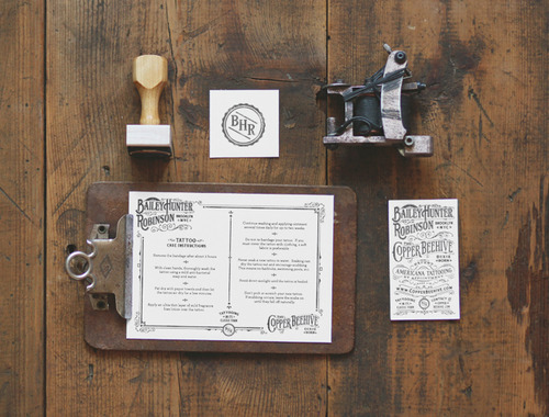
Adding A Lightbox

This demonstration of the photoset grid uses the onComplete event to assign a lightbox plugin to view the high resolution images. The code below is specific to jquery.colorbox.js, but it should work virtually the same for other plugins.
HTML:
<div class="photoset-grid-lightbox" data-layout="131" style="visibility: hidden;">
  <img src="img/demo/withhearts1-500px.jpg" width="1280" height="1707" data-highres="img/demo/withhearts1-highres.jpg">
  <img src="img/demo/withhearts2-500px.jpg" width="500" height="663" data-highres="img/demo/withhearts2-highres.jpg">
  <img src="img/demo/withhearts3-500px.jpg" width="500" height="500" data-highres="img/demo/withhearts3-highres.jpg">
  <img src="img/demo/withhearts4-500px.jpg" width="500" height="500" data-highres="img/demo/withhearts4-highres.jpg">
  <img src="img/demo/withhearts5-500px.jpg" width="1280" height="1280" data-highres="img/demo/withhearts5-highres.jpg">
</div>
Javascript:
$('.photoset-grid-lightbox').photosetGrid({
  highresLinks: true,
  rel: 'withhearts-gallery',
  gutter: '2px',

  onComplete: function(){
    $('.photoset-grid-lightbox').attr('style', '');
    $('.photoset-grid-lightbox a').colorbox({
      photo: true,
      scalePhotos: true,
      maxHeight:'90%',
      maxWidth:'90%'
    });
  }
});
Adding Photoset Grid to Tumblr Themes
HTML:
{block:Photoset}
  <div class="photoset-grid" data-layout="{PhotosetLayout}" data-id="photoset{PostID}">
    {block:Photos}
      <img src="{PhotoURL-500}"
        {block:HighRes}data-highres="{PhotoURL-HighRes}"{/block:HighRes}
        width="{PhotoWidth-500}" height="{PhotoHeight-500}"
        {block:Caption}alt="{Caption}"{/block:caption} />
    {/block:Photos}
  </div>

  {block:Caption}
    {Caption}
  {/block:caption}
{/block:Photoset}
Javascript:
$('.photoset-grid').photosetGrid({
  highresLinks: true,
  rel: $('.photoset-grid').attr('data-id'),
  gutter: '5px',

  onComplete: function(){});
  }
});
Usage
Apply the photo set grid layout to a selected div containing images for the grid.
The only markup requirement is a data-layout attribute on the selected div. data-layout should contain a string of numbers representing the number of columns for each row.
As an option you can set the height and width attributes on all the images to instantly layout the grid, otherwise the plugin will wait for all images to load.
Understanding data-layout:
data-layout="2331"1st row has 2 images, 2nd row has 3 images, 3rd row has 3 images, and 4th row has 1 image. Total of 9 images.data-layout="13"1st row has 1 image and 2nd row has 3 images.
Arguments:
width-stringChange the width that the photo set grid will be rendered at. Default:100%automatically fits its container for responsive layoutslayout-stringManually set a string of numbers to specify the number of images each row contains. Default:nullgenerates a stacked layout of one image per rowgutter-stringSet the pixel width between the columns and rows. Default:0pxhighresLinks-booleanSet totrueto automatically swap out the default imagesrcwith thedata-highresattribute once the image is wider thanlowresWidth. This will also wrap each image with anavs.divelement. Default:falselowresWidth-numberSets the width where the default image is swapped out for the high resolution image. Default:500rel-stringThis optional setting useful for lightbox viewers applies a common `rel` attribute to the anchor tags wrapping the images. Default:''onInit-functionDefine a function to be called when the plugin is initialized.onComplete-functionDefine a function to be called when the plugin has completed the grid layout.
Installation
Bower package manager
You can easily install photoset-grid as a Bower package by running:
$ bower install photoset-grid